
i・do packaging design
brand design
client: antidote vertriebs gmbh

An in-depth exploration of visual possibilities to ship cutting-edge, modern packaging that anticipates visual trends before they become mainstream.
DESCRIPTION:
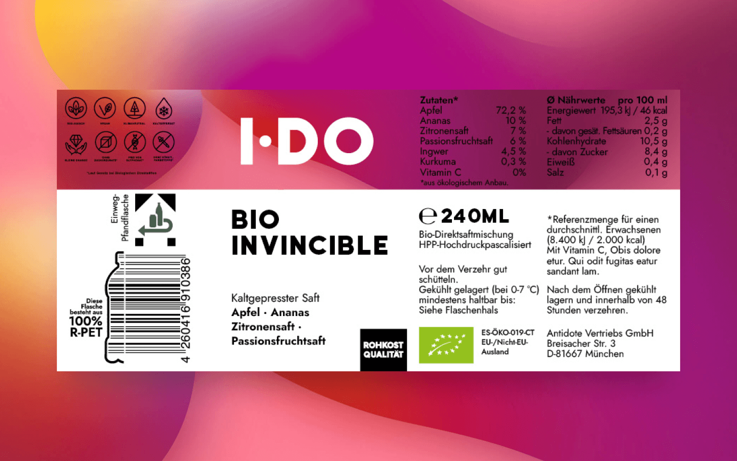
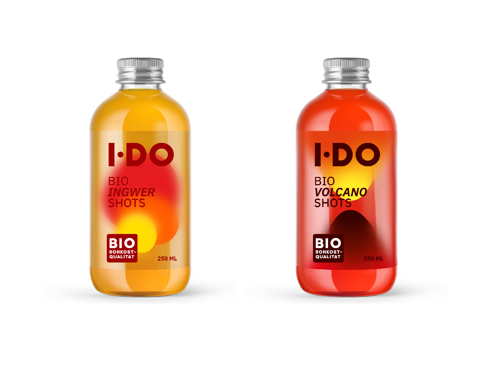
I・DO, cold pressed raw fruit and vegetable juices, is the main product of F&B company Antidote Vertriebs GmbH.
Confronted with a radical change in the bottles, Antidote took the chance for a redesign of the labels.
CHALLENGE:
Design two package concepts: one for the new bottles of existing products and one for new products.
Visually deliver the products' unique selling points while targeting the relevant user group(s).
Design process
The story of the new labels for Antidote's bottles is one of resilience, research, and patient exploration.
Distributors demanded that Antidote give up plastic in favour of other materials or recyclable PET.
It was necessary to determine which new material could meet production and distribution requirements, protect the existing market positioning and brand voice, and stay within budget.
competitors
In this research process, I come into play as a strategic designer, gathering information on competitors’ packaging regarding materials, look and feel, and the various stylistic possibilities in use for the design.

Style Analysis
Having gathered market intelligence and considered Antidote’s target audience, the next step was to conduct a thorough analysis of the various visual styles, their potential and their possible limitations.

materials and Look & Feel
Having compiled a range of stylistic options, it was now time to consider the type of packaging, and a meticulous exploration phase began, in which materials and available illustrations and photographs were combined using 3D mock-ups.

initial drafts
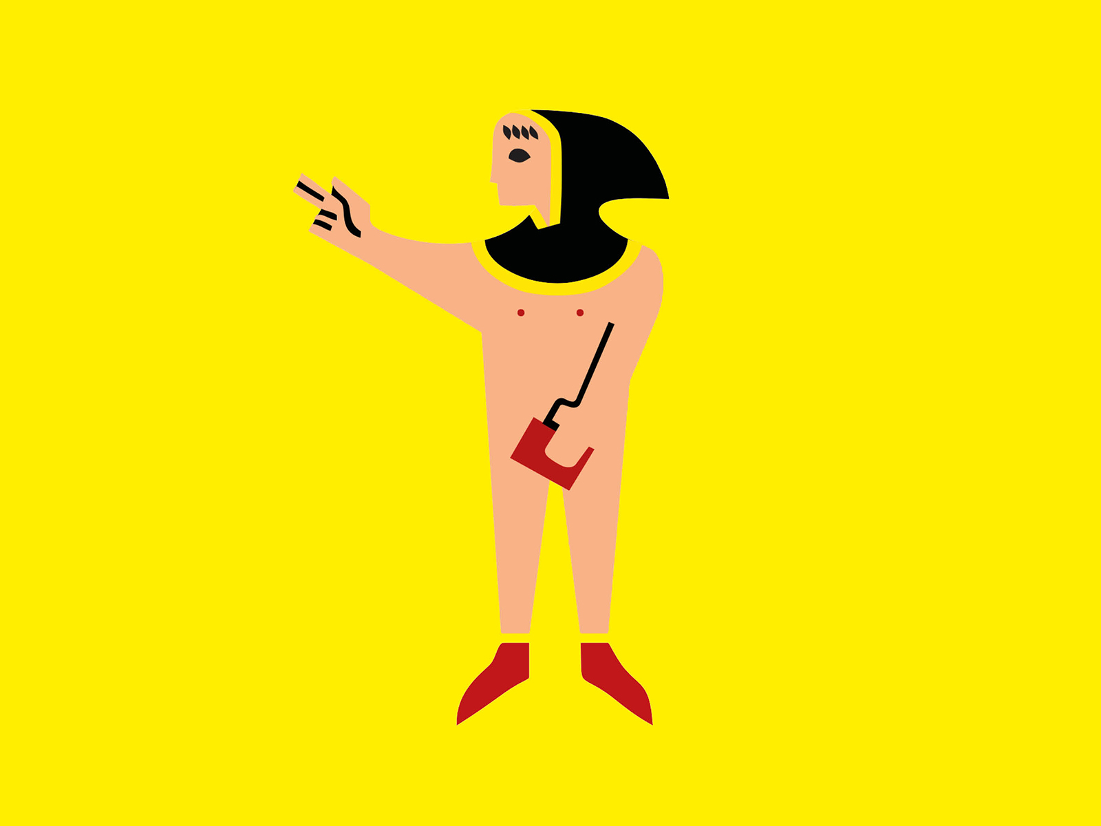
After the initial rounds of feedback with the team and stakeholders, preferences among the stylistic options begin to emerge. An illustrative yet rather abstract style seems to be the preferred choice.
At this stage, I produced a few initial illustrations to bring the ideas to life, and started sketching designs to incorporate into the final labels.


FINALISING THE DESIGN FOR THE EXISTING PRODUCTS


FINALISING THE DESIGN FOR THE NEW PRODUCTS
Faced with the prospect of no longer being able to use the High-Pressure Processing (HPP) method, the company is also considered launching a new range of pasteurised products Tetra Pak or glass bottles.
A second design was developed for this product range, again using abstract shapes and, above all, patterns.


more work

info@annasette.com
© 2026 Anna Sette - Website built with Semplice