I•DO BRAND DEVELOPMENT - 2018
Strategy | Graphic Design | Information Design
Client: Antidote Vertriebs GmbH
DESCRIPTION:
I•DO, cold pressed raw fruit and vegetable juices, is the main product of F&B company Antidote Vertriebs GmbH.
Confronted with a legal problem, the company had to rename its main product (from Antidote to I•DO) and needed a branding update using the new logo and design of new marketing collateral.
CHALLENGE:
Design of new communication materials consistent to existing corporate identity.
Suggest a new logo design.
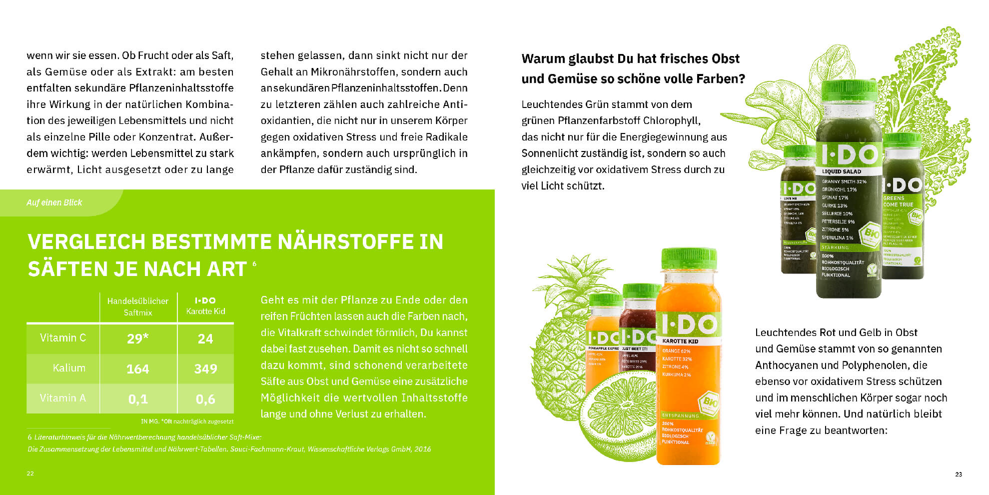
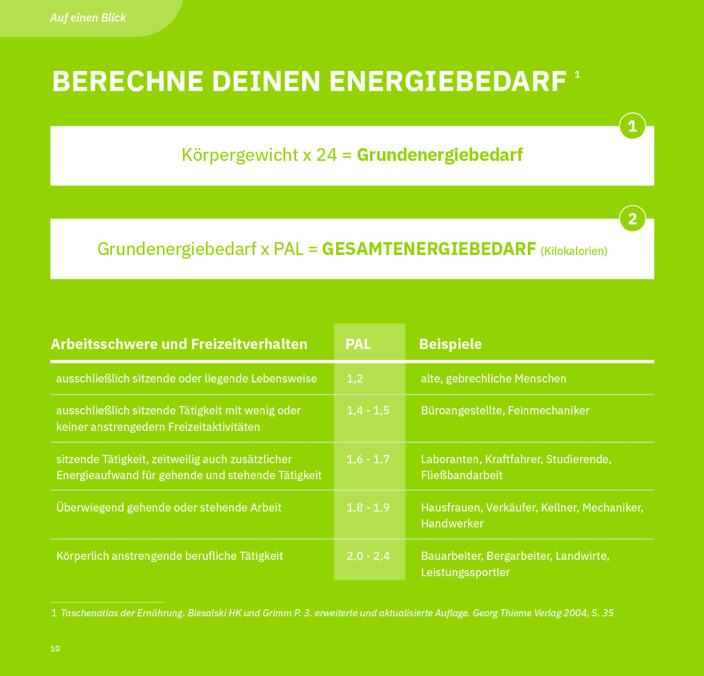
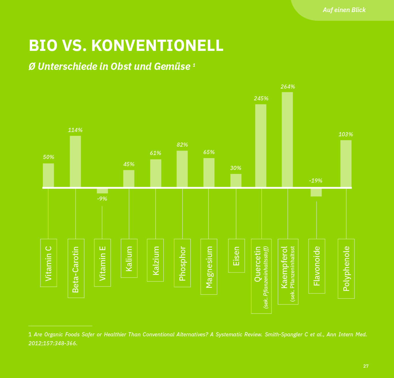
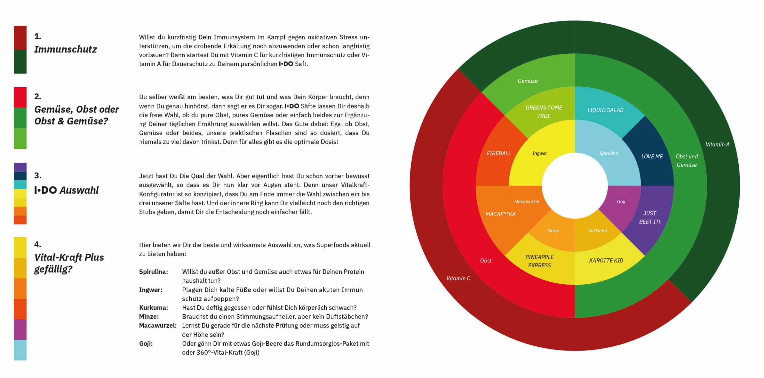
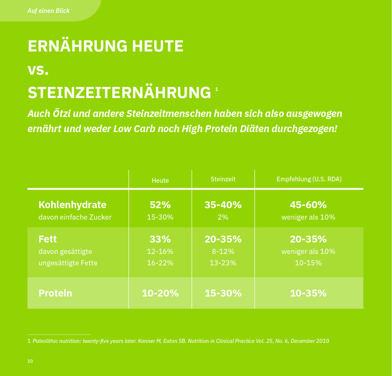
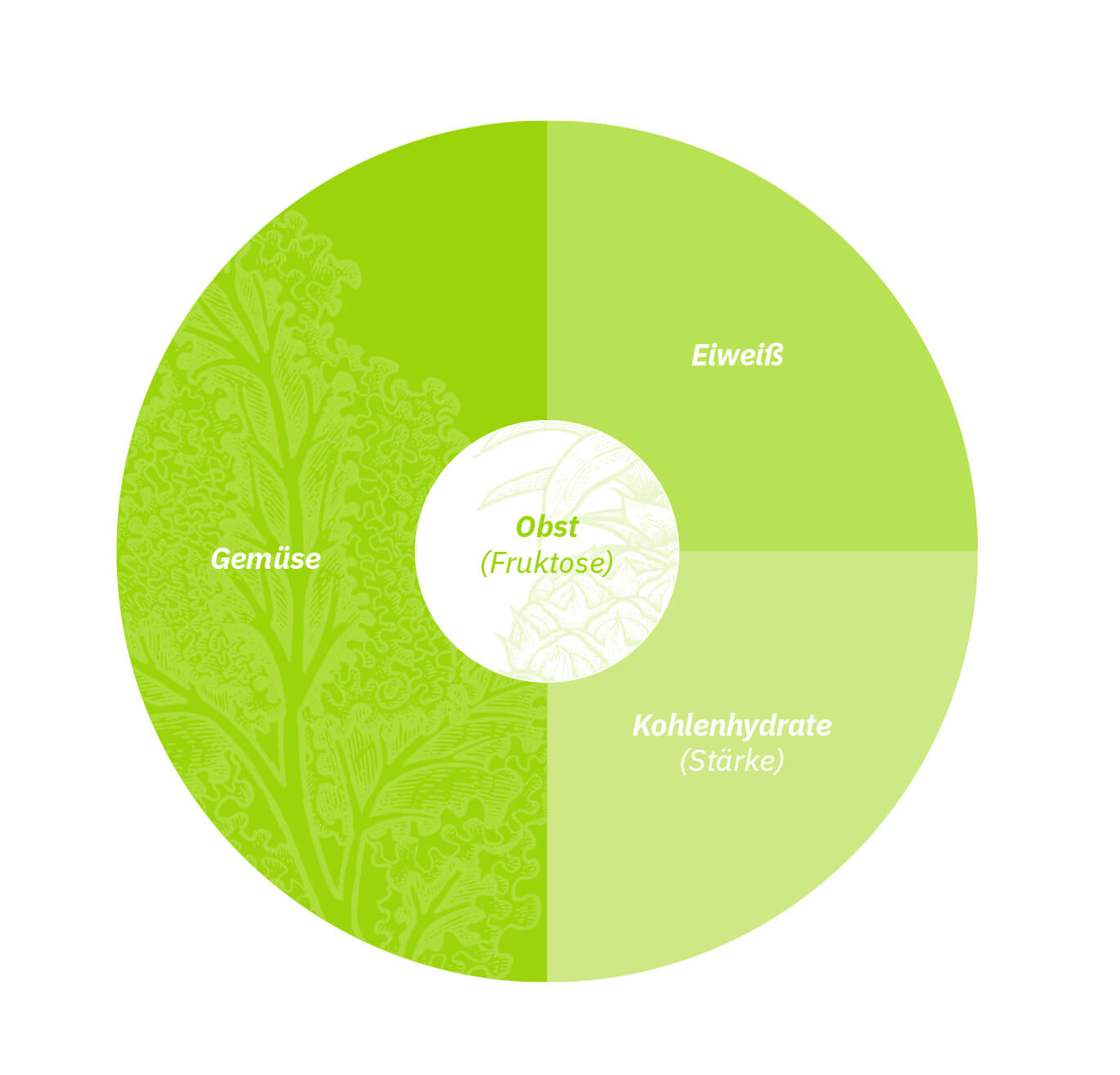
Design of infographics that translate the results of a commissioned scientific research on the nutrional value and fitness benefits of products into aestethically pleasing informational material.
MY APPROACH:
1) In-depth assessment of the given corporate identity elements.
2) Brand design and graphic design of marketing assets and infographics ensuring consistency and feasibility within the budget.
3) Allocate time for debriefing and further enquiries, particularly on scientific research conclusions, consumer groups and USPs to highlight both accordingly in the design.
4) Liaise with printers and production partners to ensure budget adherence and timely delivery.
RESULT:
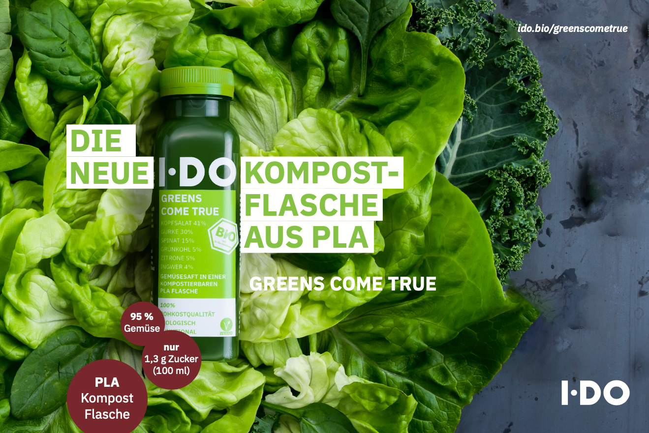
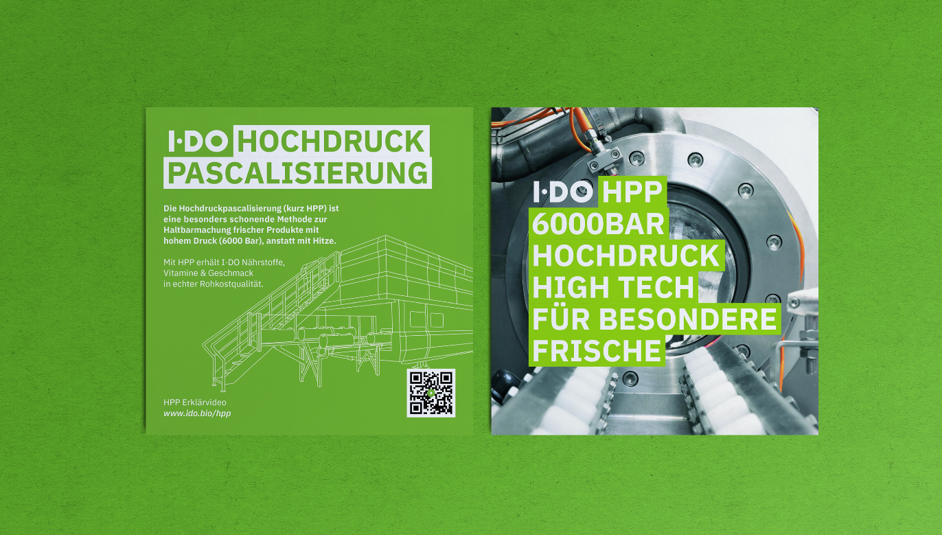
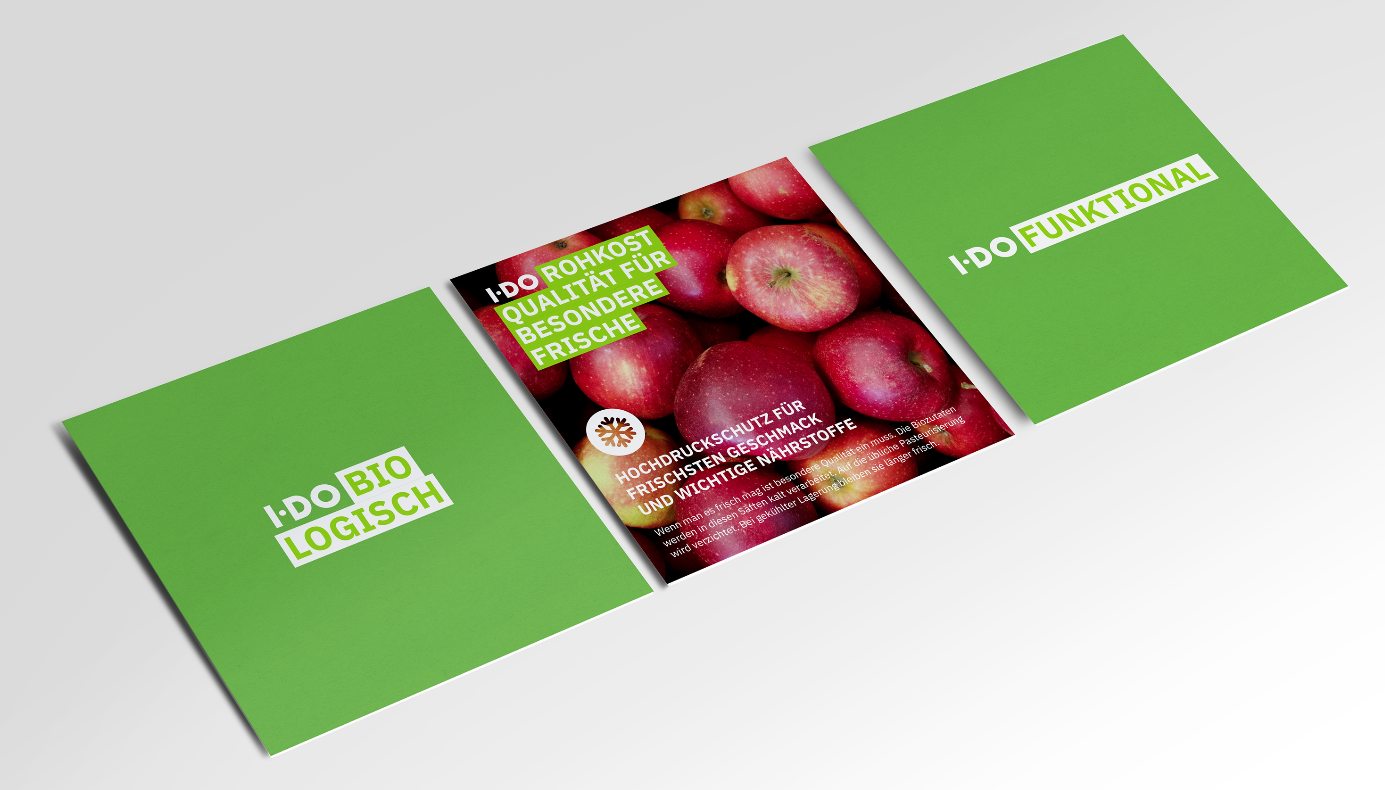
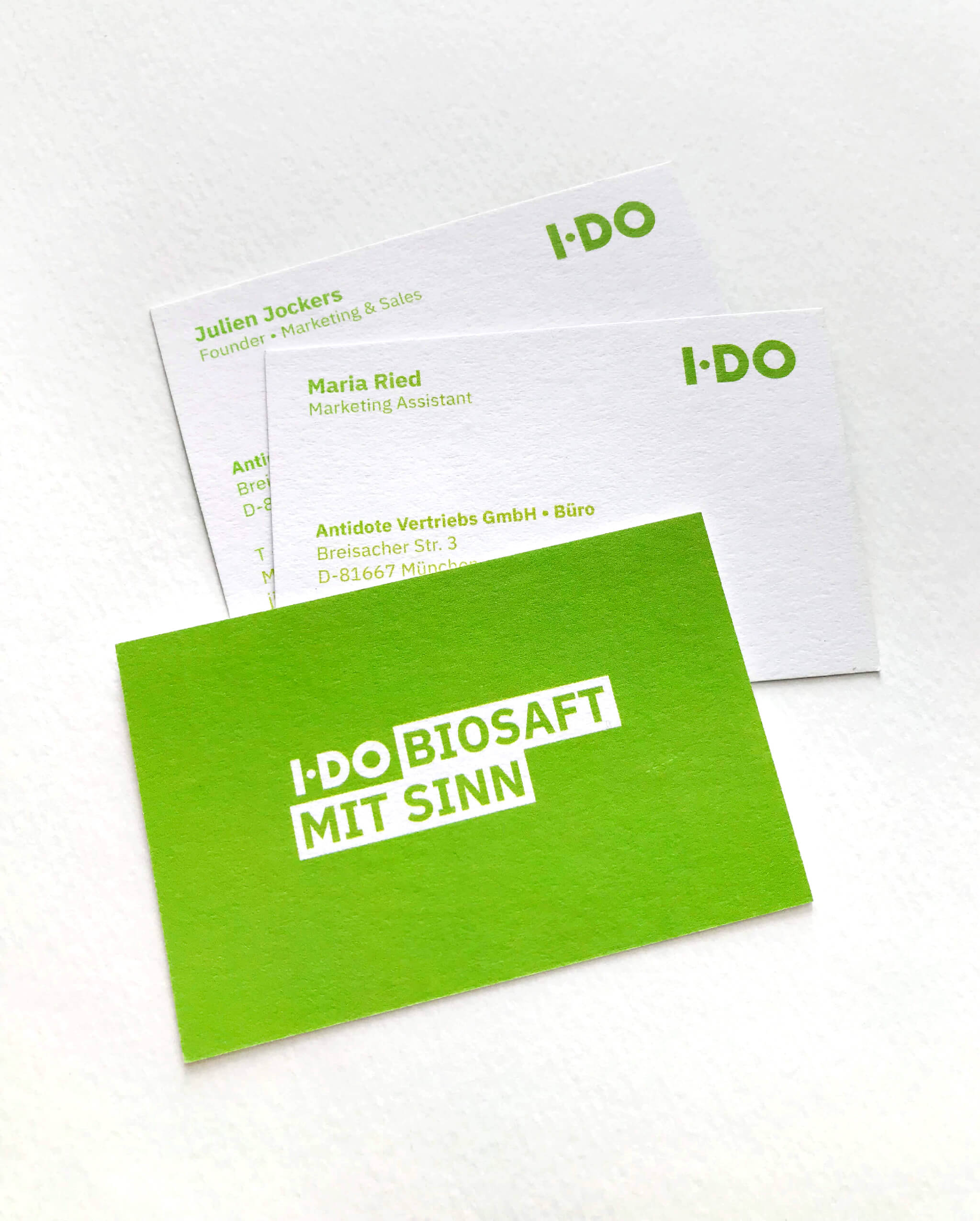
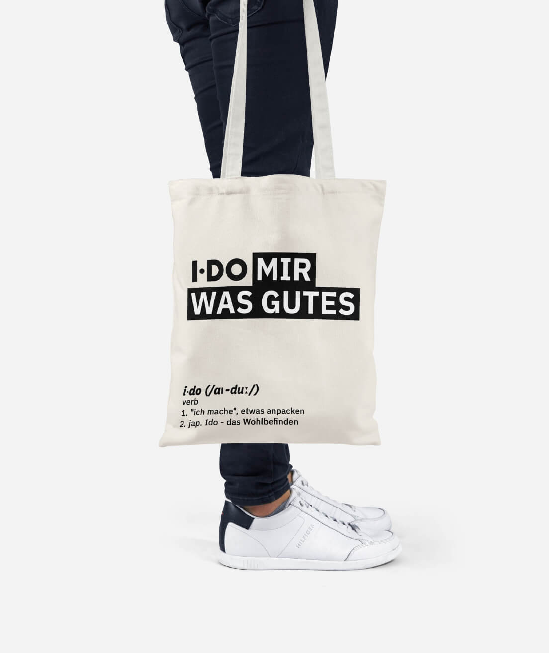
Design, production and delivery of communication materials including brochures, flyers, merchandising, POS, stationery on planned schedule.
The design is crafted so that graphics and images will immediately transmit the market positioning of the company, address consumers, visually guide the reader.
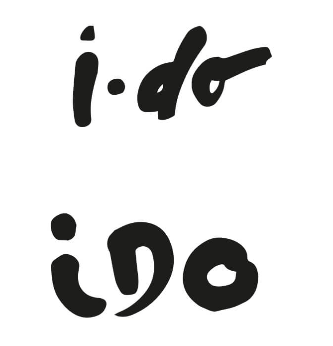
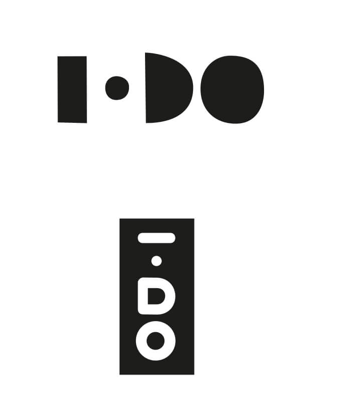
CONCEPTS FOR A NEW LOGO AND LABELS
Exploring ideas for a new logo and label design using hand-drawn typography to convey the genuine and unrefined quality of the juices' ingredients.

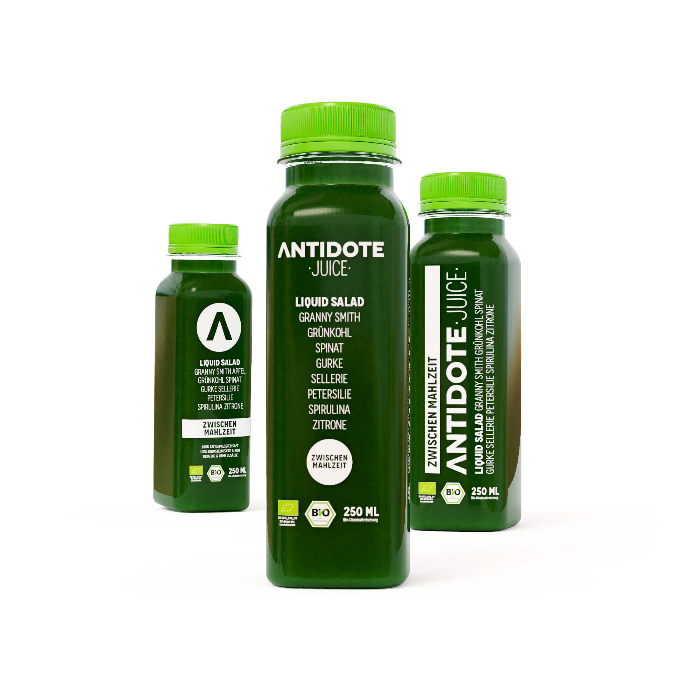
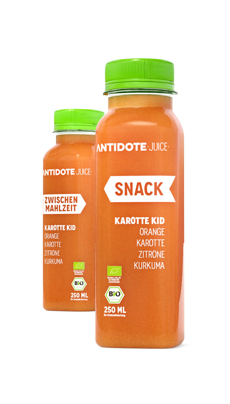
THE FINAL DESIGN
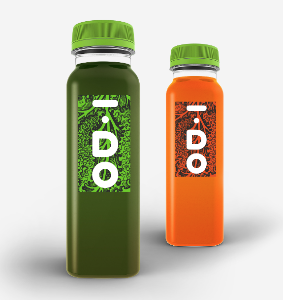
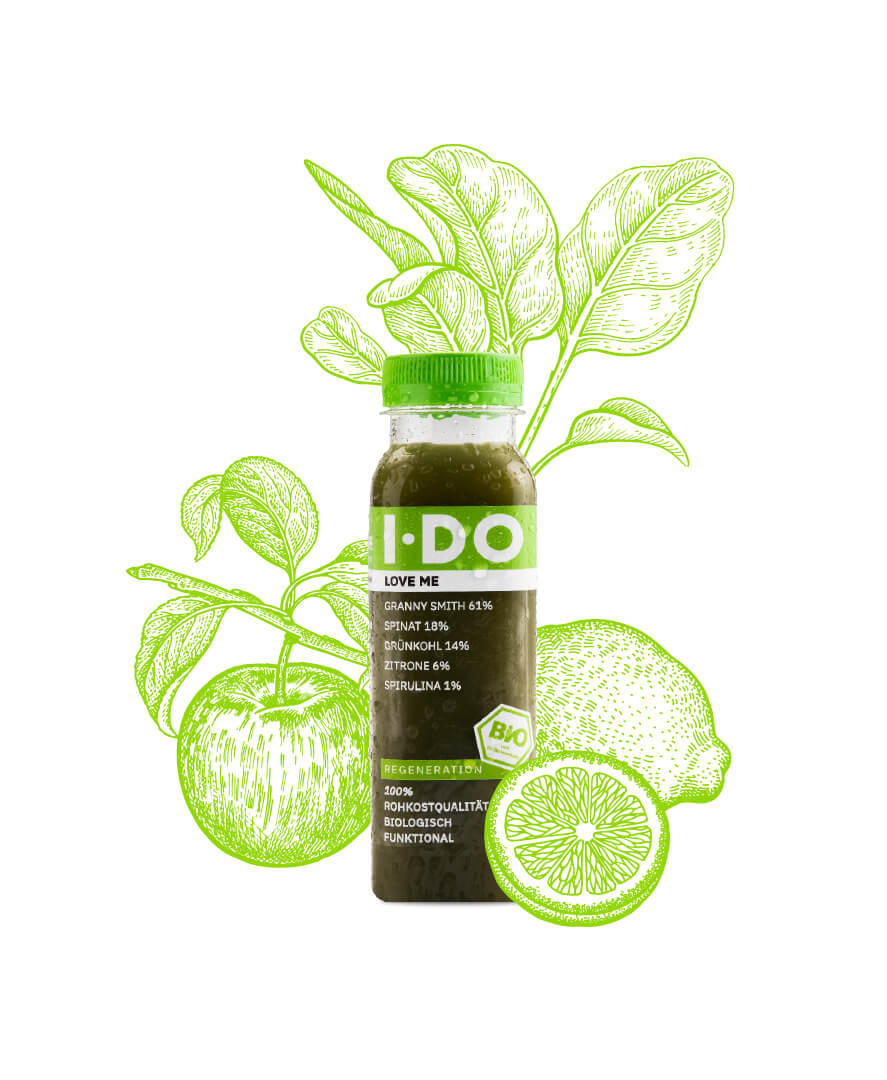
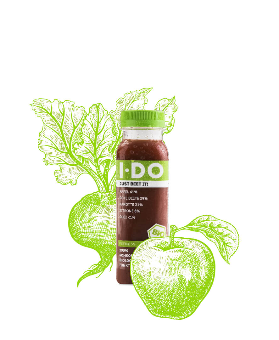
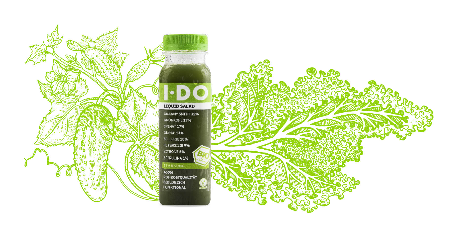
Illustrations of vegetables and fruits - ingredients of the juices - were integrated harmoniously within the given CI as new branding elements.
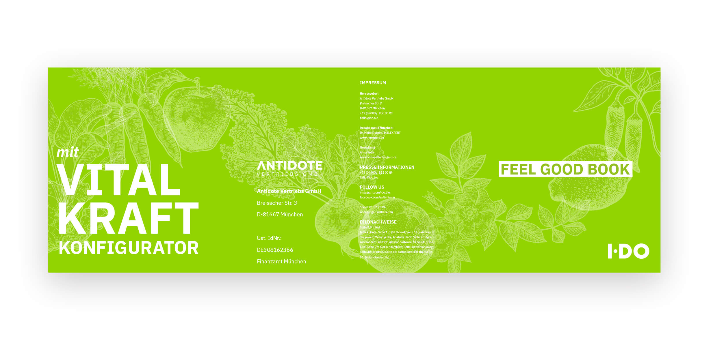
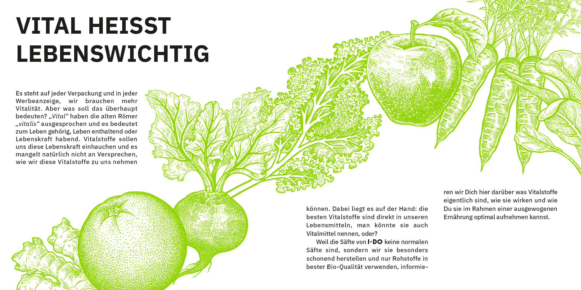
I used the illustrations to create a flexible, visually appealing key visual concept for the entire product range.
Consistency is maintained by using the brand's main colour throughout.

© 2025 Anna Sette - Website built with Semplice
© 2025 Anna Sette - Website built with Semplice