
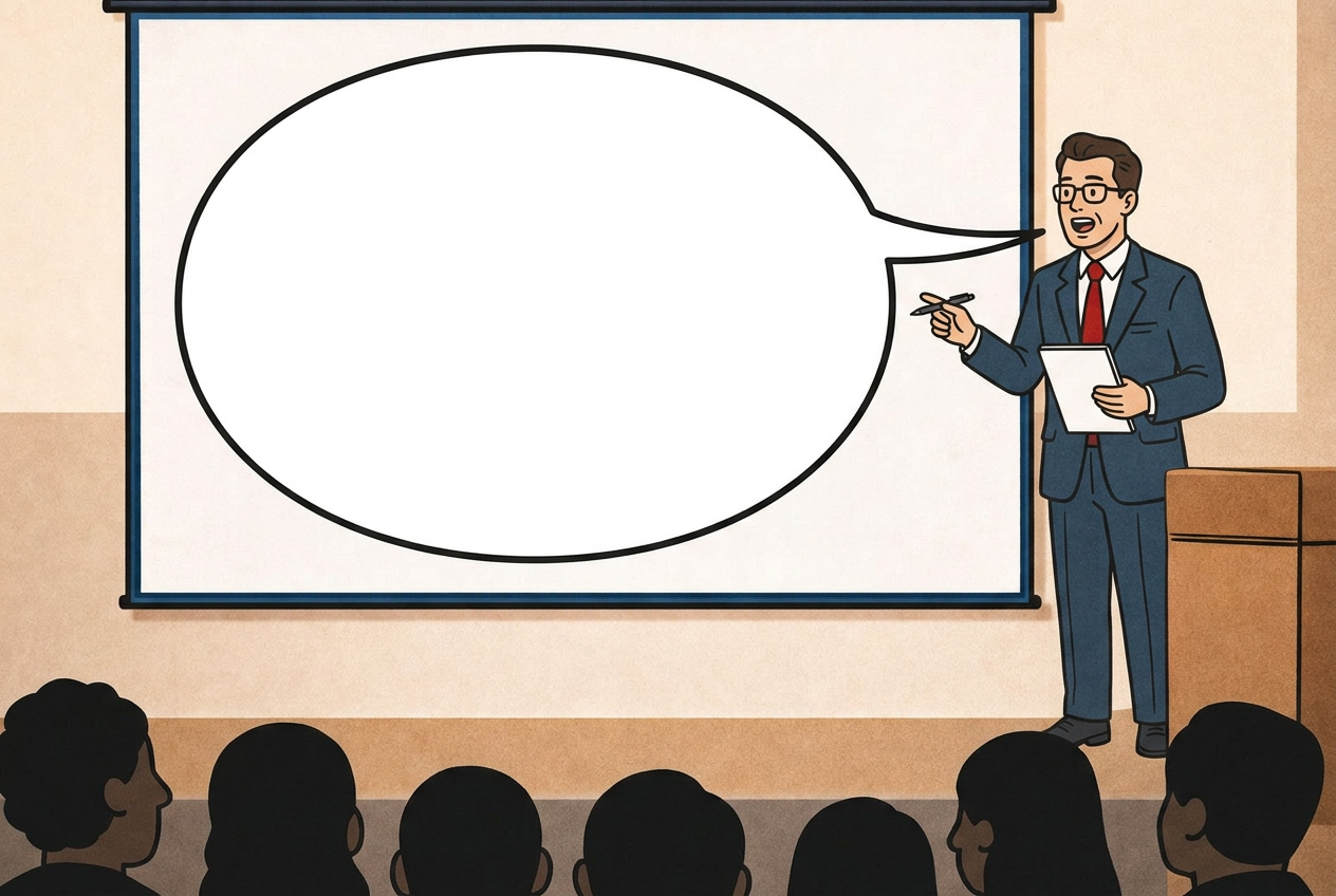
What you see is sometimes not what you hear.
Sitting in the audience at a conference or in a presentation room can be a dreary experience, particularly when the topic is difficult or very technical and one doesn´t have all the knowledge needed to grasp concepts quickly.
Applying usability principles rooted in the findings of cognitive psychology will increase enormously the effectivness of your live communication.
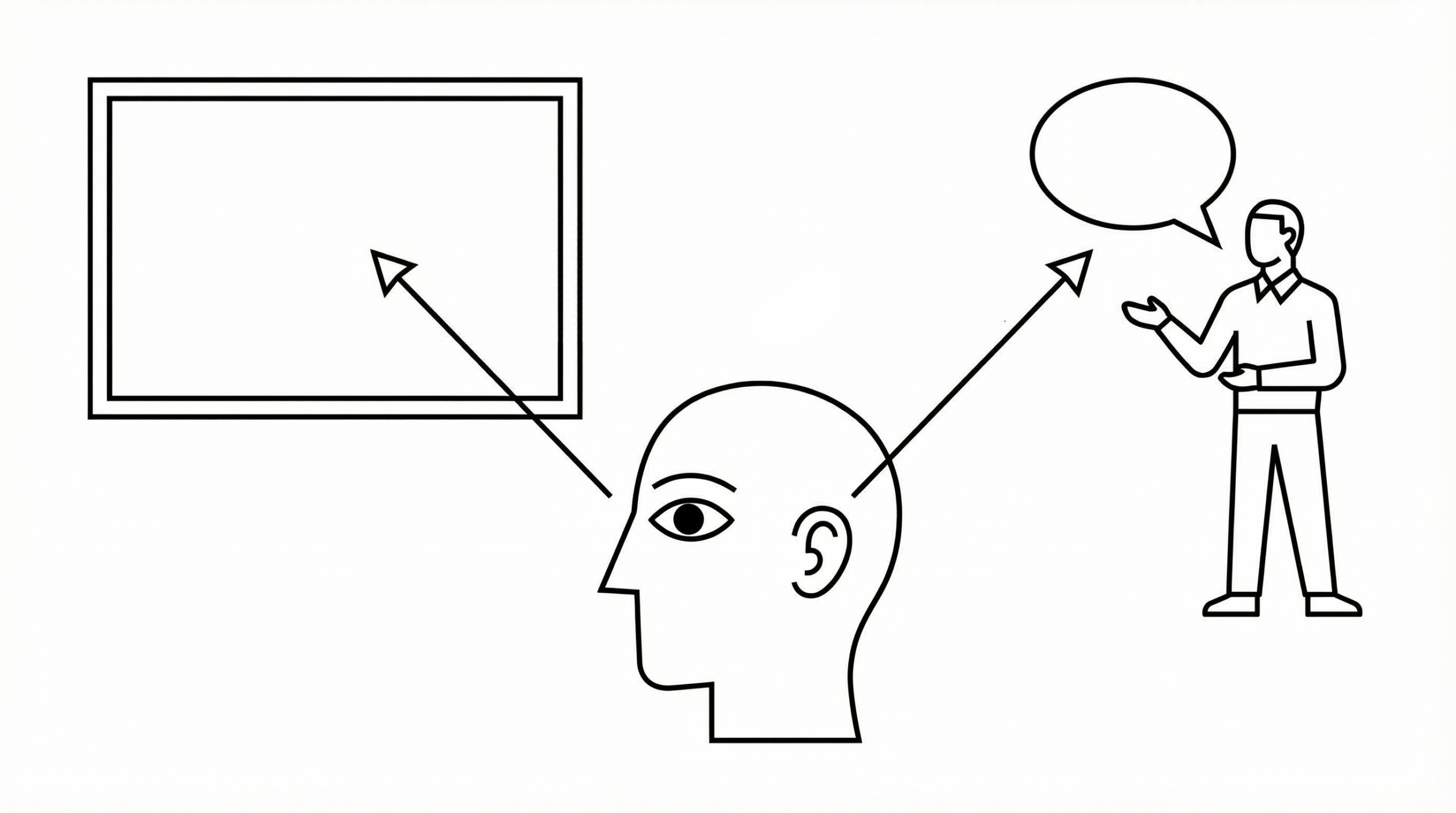
Human perception is a selective process.
When dealing with two different sources of information at the same time we testify that those very important persons who should follow us closely and understand us suffer under the phenomena of split-attention*.
They will try to listen to your voice AND read your slide at the same time, if you are talking AND showing your slide at the same time.
*https://en.wikipedia.org/wiki/Split_attention_effect
What is the point of presentations then?
1) they convey important information besides the content of the presentation about your company.
Through branding, a immediate recognasibility of your company, thanks to logo, colors, type, style, feelings evoked.
Then through: Your company name, the name of your product; your name, contact data.
That is, for networking to that live event, of course fundamental.
It is good if people can adress you by name in the coffee corner after you have given your presentation.
2) they support your affirmations showing process, data, sources, testimonials.
3) they can entertain, to keep engagement up, if you want or need to: funny short videos, animated graphics, interactive polls.
4) they offer a visual memo for the audience to take a snapshot of, if they want to quickly record a particular information without jetting it down on a notepad or their smartphones (missing a slide or too, maybe).
What live presentations should't be (never ever):
- your own personal notesheet to look at, so you won’t forget the things you want to say
- an extra load of obscure information your public should bring home and study after the presentation if they want to (unless you are a professor in a university giving a lesson, that is.)
The principles of good presentations (according to... me):
I think that all the live presentations in the world should follow three golden rule:
1) be brief
2) go slow
3) pause
Every slide should address one concept only and use around 15 words.
A pause after the slide comes up will let people read it before the listening begins: that is done in about 20 seconds, if the slide is 15 words long.
You might say: But my stuff is super technical
I need to go into technicalities! I need at least 50 words!
Well, you might need 50 words on the slide, your audience doesn’t.
Your audience needs a visual introduction to a certain concept.
They should be able to absorb it in matters of seconds.
After that, they need to listen to you with full attention.
And for that, you might want to work on your presentation skills rather then your writing skills.
Learn how to engage your audience, draw attention, entertain if it must, pausing long enough, so that they will have time to process information.
How to avoid competing with your slide for attention during a live presentation:
1) read it out loud
Then you won’t have to pause to let people read first, if that is awkward for you.
This works best if your slide is short and contains just words.
Here is one of my favourite presentations ever. I know, you are still way much more technical, but we want to learn the principles here.
https://www.youtube.com/watch?v=d1yfb93beSI
The presentator is reading out loud EVERY SINGLE SLIDE. And on top of that, she makes a PAUSE everytime a new concept comes up.
I doubt I missed a word out of the whole 9 minutes.
I am bored, nope.
But you could also guide your audience through a graphic.
How? let´s come to it after the point number 2, the direction of reading.
2) be aware of the direction of reading
if you are in a country using a from left-to-right direction of reading, your explanation of a slide needs to begin from the top-left corner of the slide.
That means: any slide has to begin from the top-left corner of your slide.
There is where people naturally look at when the new slide comes up.
If you start by describing a graphic placed in the bottom-right of the screen, people will be - for a couple of seconds - very confused.
They will go: What is she talking about? Where should I look?
Confused people are already lost.
While you keep talking and they are looking for their way through the information.
Not going along with the natural reading patterns of an audience has its price, you are paying for a lack of empathy in the communication process.
3) use colors
You can subtly add more guidance by using colors and call them out to have people pointing the attention to differ areas of your slide.
How to use colors:
Maximum 3 or 4 colors, very different from each other.
Pull them through, taking care that they don't get messed up semantically along the way.
If RED means “employees”, it should mean it until the end of the presentation.
4) get rid of everything which is not needed.
Fancy backgrounds, your name and contact and logo on each slide, page numbers. Pictures even if they don't add to the storytelling, watermarks, that logo repeated in its short version just to make sure.
I would also ask if a title is really needed.
People rarely read titles, I wonder if one could jump straight in.
For all of those having to show a disclaimer slide written in 14 pt that only the first row can decipher: I feel you. Pull it up while people are taking places or gathering themselves after a previous presentation, or, if allowed, take it off the live show and re-introduce it in the handout.
Same with given brand you should display your content in: Make sure your content can breath and it doesn't get visually jeopardise by that branding.
Happy presenting!
No Comments.