
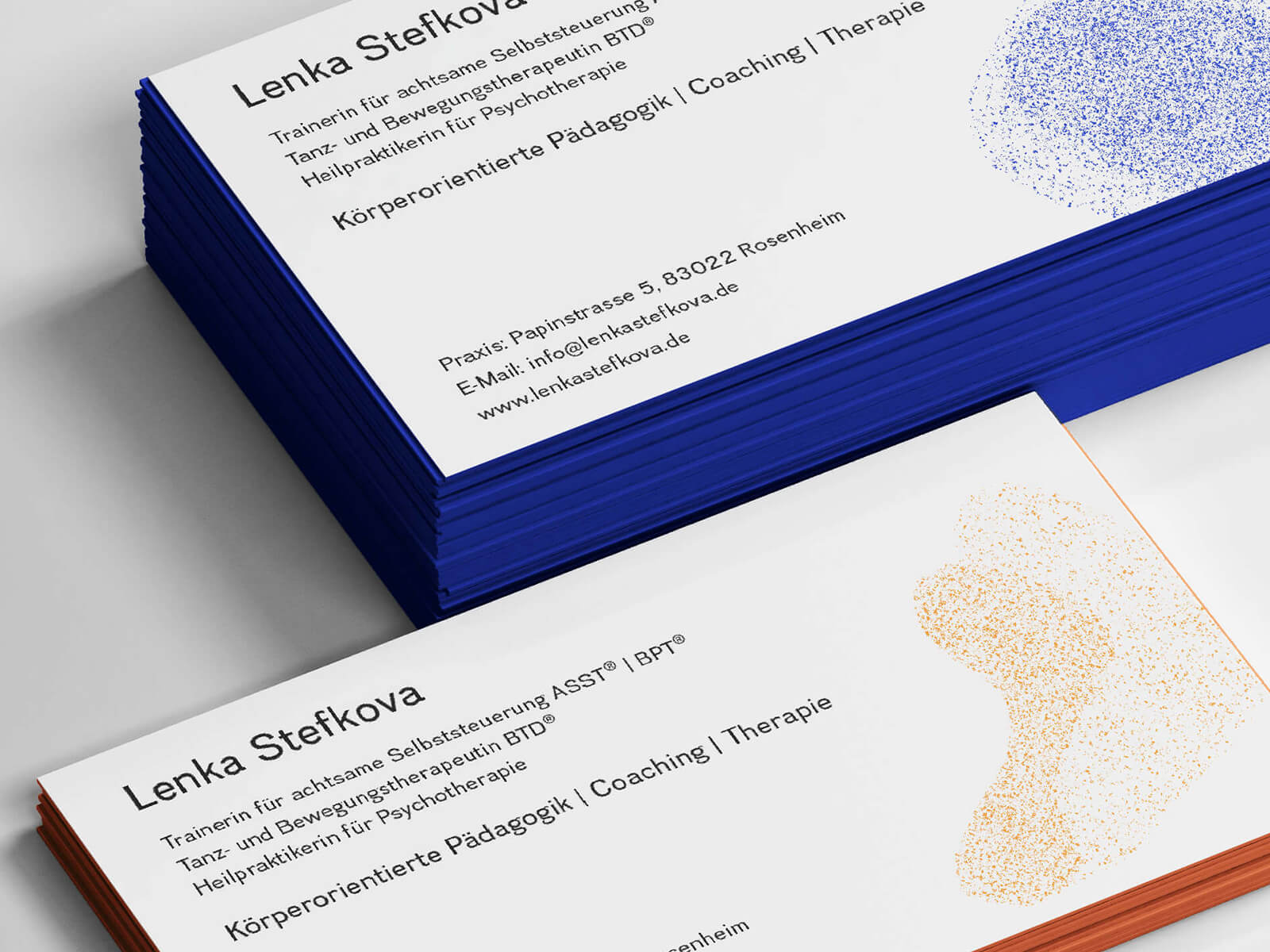
lenka stefkova
brand design
client: lenka stefkova

A visual identity that flows and changes to show the idea of dancing in a healing environment, where trust and working together create the path to healing.
DESCRIPTION:
Lenka Stefkova is a dance therapeut with moreover then 30 years experience, working with single clients as well as in group settings in clinical environment.
CHALLENGE:
Develop a branding concept that captures the idea of dance therapy as an ever-changing process rooted in the relationship between therapist and client.
Design a visual identity that conveys Lenka Stefkova's personality and approach.
THE IDEA BEHIND THE brand


The branding I designed is inspired by the natural phenomenon of murmuration: the long, fluid, coordinated and mesmerising dances performed by hundreds of starlings in the sky.
Dance therapy is rooted in the same intuitive awareness of movement. The bird, which can fly using its body's intuition to leverage wind currents in order to stay airborne and change direction, symbolises both dance therapy and Lenka's self-aware, elegant and harmonious temperament.


Utilising the key visuals in unison, I rendered the effect of the murmurations in animation, thereby conveying the notion of dancing and collaborating, which is indicative of dance therapy, in three dimensions.


The printed branding assets include business stationery, flyers detailing individual services and master forms for teaching and consultancy activities.


more work


info@annasette.com
© 2026 Anna Sette - Website built with Semplice