
Is design a vehicle to increase trust in science and its communication?
I think it is.
At the least, if design is "good design".
By "good design", it is usable design intended.
As defined by Donald Norman, usability is something that guides an happy interaction without being detected.
Usable design stays invisible and yet it can help information cut the cheese and deliver messages.
That is important, if that information aspires to be trustworthy.
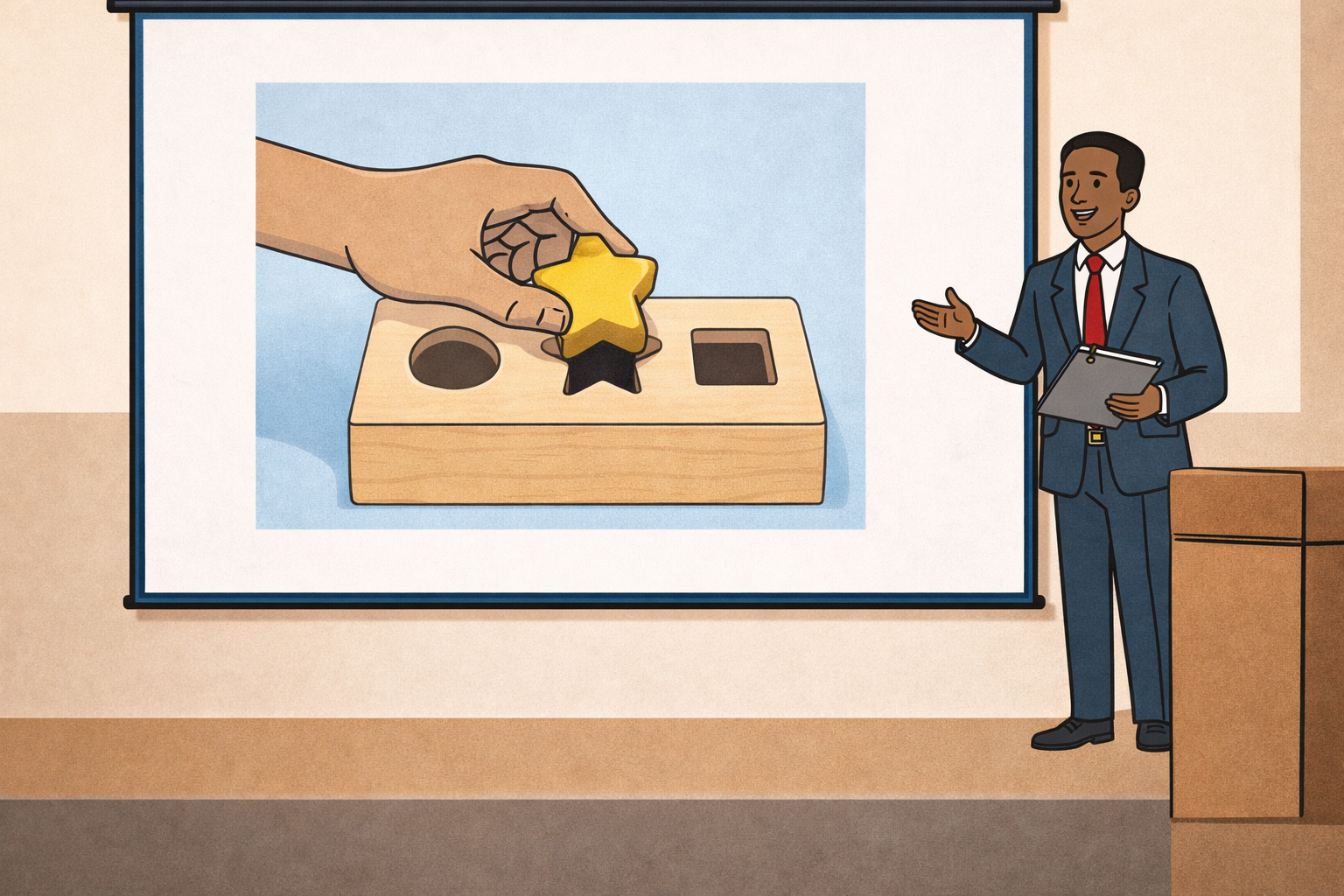
What are we talking about, when it comes to the design of presentations?
As I attended a webinar by the European Competence Centre for Science Communication on misinformation in science communication a couple of weeks ago, I gained insights into which channels are mostly used to seek reliable information and how reliable sources are identified.
Trust is subjective and based on several factors, one of which is believing in the expertise of the source. It is no surprise that the participants agreed that the most reliable sources are, first, peer-reviewed research papers and, second, university press releases.
For “non-scholarly” sources, design becomes fundamental to build reliability.
Applying usability principles that support communication effectiveness in a presentation, coupled with aesthetic decisions that goes with those usability choices - using a certain type of font, a certain font size, a particular background color, picking that particular image and, of course, the visual structure with which they are all come together - could be a gateway for trustworthiness.
Thinking of the notorious guide about web usability by Steve Krug: “Don´t make me think”.
"Don´t make them think" turns out to be the key, when thinking and exercising qualitative evaluation is required, like when receiving scientific information.
That is more urgent, the less the adressed public possess scientific knowledge.
Businessmen, investors, marketeers, they also need to be caught where they understanding of a particular subject ends, and usability helps that immensely.
Attention grabbing and loud design are sometimes a no brainer, particularly in marketing. There is noise out there and being loud, sticking out of the crowd, helps to draw attention.
And yet when communicating facts clarity and following usability principles to ensure delivering the message without friction should be the priority of the design efforts.
My opinion in February 2026 is that humans have here an advantage on AI.
I am exploring the seemingly never ending multitude of options of automation for building slides.
Very few deliver outputs which are convincing and follows the rule of “good design”.
Even dedicated tool like Gamma leave to wonder if the glossy appeal really helps. In the prompting usability shouldn't miss, and yet a trained eye, the awareness of our audience's needs, the goal of the communication and the context in which it happens are indispensable for that final trust-arousing tweak.
Cover image generated with Sora by OpenAI
No Comments.